2019 Brand Refresh

Say hello to Improv's brand refresh.

There’s a look and feel to everything we do at Improv. Living and breathing inside of that look and feel is a story we started telling nearly 30 years ago. It’s a story about passion, perseverance, and helping real people solve real problems in the workplace.

It’s a story about a company that keeps its promises. Visually there’s nothing arbitrary — not a color, a concept, a font, or a phrase. Our brand springs from an established culture rooted in honesty, expertise, creativity, and collaboration.

Our Company

Values

  1. We Do What We Say

    Our team will never promise what we can’t deliver. We operate with a culture of vulnerability and honesty. Your success is our success – we pride ourselves in performing with the highest level of integrity.

  2. Teamwork

    Every individual on the Improvizations’ team brings valued skills and perspective. In order for us to be a successful team, we must invest in each other. Sharing knowledge and experiences allows us all to grow in our field.

  3. Simplicity & Common Sense

    The field of workforce management is complex. Every day we work with complicated union rules, government regulations, mergers, and acquisitions. The value we provide comes not only from our knowledge and experience with Kronos, but also in our approach.

  4. Ethical Behavior

    Our standards don’t change. We expect ethical behavior from every employee in any situation. No exceptions.

Mission

The Idea That Drives Us

Our expertise is workforce technology but our one thing — the ‘why’ that drives us — is helping people experience the power and joy in the work they do.

The Belief That Defines Us

We listen. We engage. We do what we say.

This shared creed underpins our brand story. Our team is hyper-intentional. We listen to a client’s needs, dig deep into their culture and workflows, and offer solutions we believe will alleviate pain, rally efficiency, spark margins, and empower people.

The final, most important, piece is this: We do what we say.

As consultants we’ve built a successful word-of-mouth business by giving clients confidence that when they work with Improv, they are engaged with an established, accountable team that delivers what it promises.

Our Differentiator

The Workforce Creatives. We See What’s Possible.

It’s more than a tag line or a clever hook. It’s what sets us apart in a world of megabytes and modules.

Creativity is the heartbeat of our story and in the DNA of every person that is part of the Improv team. Technical expertise brings value, but it’s our collective creative thinking that enables us to re-imagine complex problems and deliver the best solution — repeatedly.

Brand Consistency

Brand Goals

  1. Clarity

    We aim for clear, concise communication with our clients. Our brand choices strive to be simple, unambiguous, unmistakable, and useful to our clients with every interaction.

  2. Creativity

    Applying uncommon creativity to complex workforce problems is our super power. Our brand exudes our hybrid technical-creative abilities with brand elements that are original, engaging, and consistently challenge familiar thinking.

  3. Collaboration

    The sum of us exceeds each one of us. We collaborate with one another and with our clients because that’s how great ideas catch fire. Our brand expresses the power (and promise) of perpetual collaboration.

  4. Curiosity

    We are lifelong learners, digital trailblazers, and relentless solution seekers. We strive to embrace that spirit of discovery in our thinking, our projects, and throughout every visual and written expression of our brand.

Logo

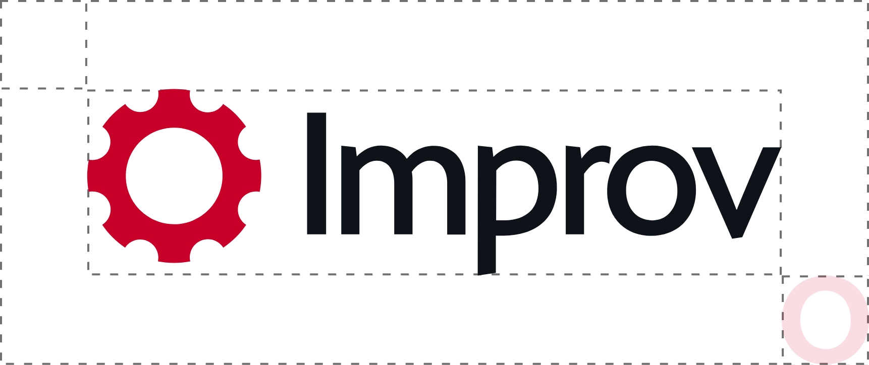
The Improv logo hasn't changed much through the years. The gear has been a strong symbol for the company's ability to continue on no matter what. We've refreshed the original gear mark to be more modern, clean, and simple.

Primary Lockup

Improv Logo Clearspace

Logo Clearspace

Improv Logo Clearspace

Alternates

Improv Logo Alternates

Colors

Our brand colors also represent who we are. Black and white gives us the structural architecture of the Improv brand. They allow for fluid layouts and a consistent, easily accessible structural backing. The red accent color symbolizes the pop of creativity Improv applies to solve complex workforce issues. It represents all the services that Improv provides.

However, we also have secondary colors that represent three main pillars of what Improv does: Implementation (Blue), Change Management (Orange), and Business Consulting (Green).

Typography

For our brand's typography, we chose Komet for headers and titles because of its mix of sharp lines and smooth curves. It represents the tight deadlines and ability to get things done but in an engaging and creative manner. For copy and small type, we chose IBM Plex Sans for its ease of readability on a screen and in print. IBM created Plex to meld man and machine. Their typeface combines the modern era of machines and the natural distinctness of the human eye.

Komet

The spectacle before us was indeed sublime.

IBM Plex Sans

Apparently we had reached a great height in the atmosphere, for the sky was a dead black, and the stars had ceased to twinkle. By the same illusion which lifts the horizon of the sea to the level of the spectator on a hillside, the sable cloud beneath was dished out, and the car seemed to float in the middle of an immense dark sphere, whose upper half was strewn with silver. Looking down into the dark gulf below, I could see a ruddy light streaming through a rift in the clouds.

Photography

Photography used throughout the site, on the blog, and in printed media must have a consistent style, look, and feel. They must be high quality, but not high in file size.

Motion

Improv's motion graphics need to match the brand. They must have ample contrast between simplicity and creativity. Improv aims to be modern and attention-grabbing with this refresh. Motion will be used on the website, in marketing, and throughout the brand in general.

Iconography

The iconography used throughout the Improv brand is a mix of Font Awesome 5, Material Icons, and icons created for specific purposes. Until an Improv specific icon set is created, use an icon that best fits the brand and its style.

Below are a few icon resources for use.

material icons

Font Awesome 5

Font Awesome is a great resource for icons on the web. https://fontawesome.com/

Material Design Icons

Material Icons are consistent and clean. https://material.io/tools/icons/

Flaticon

Flaticon should be used sparingly. If an icon is used from here, it should be modified in some way or another. https://www.flaticon.com/